


BRAND HISTORY

BRAND HISTORY
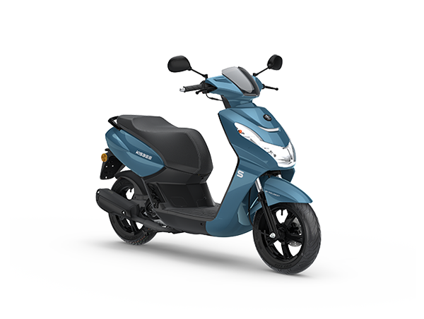
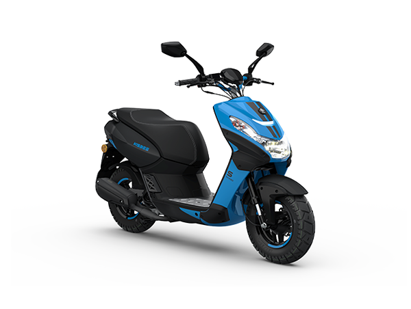
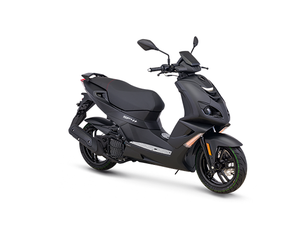
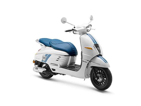
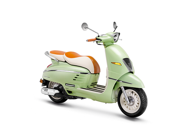
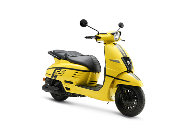
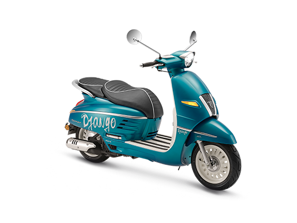
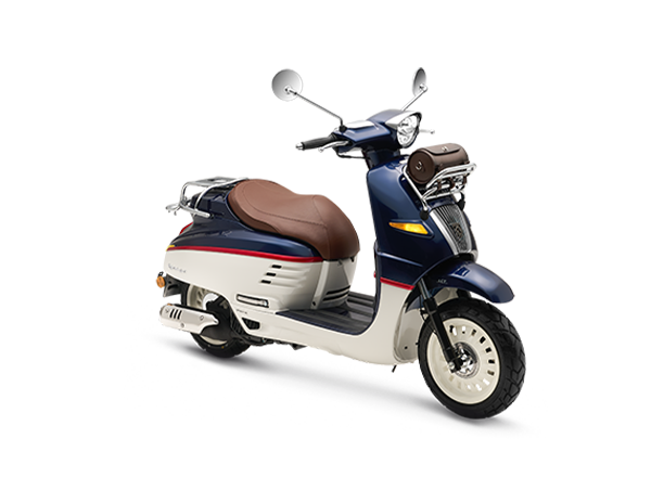
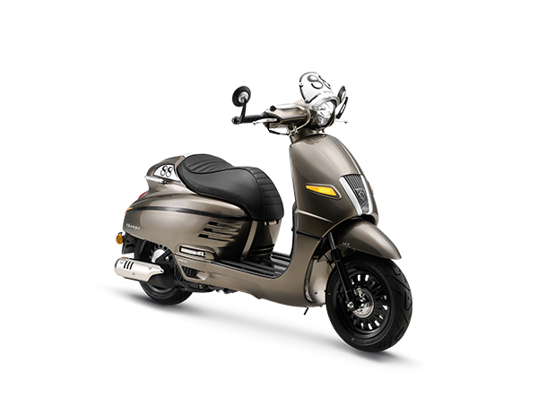
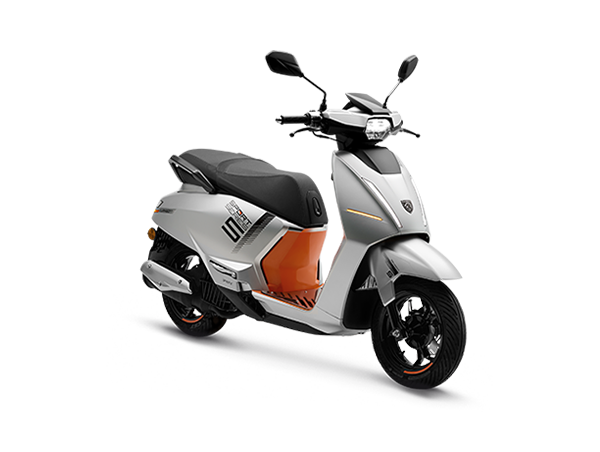
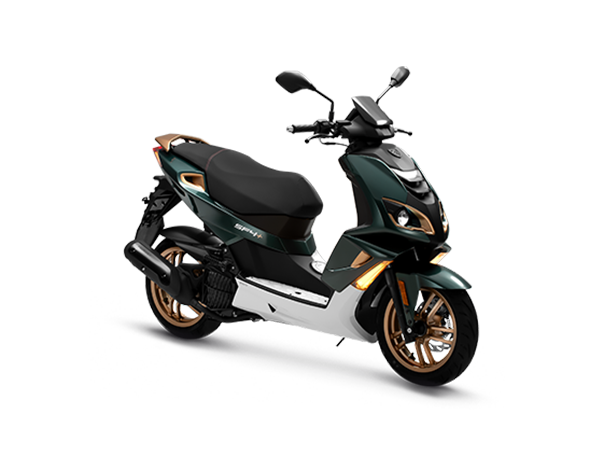
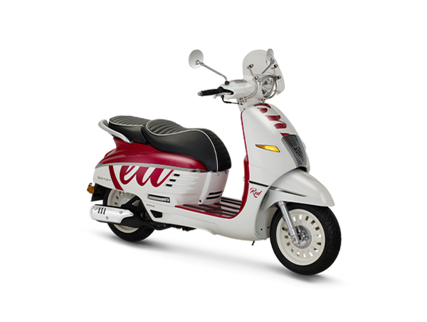
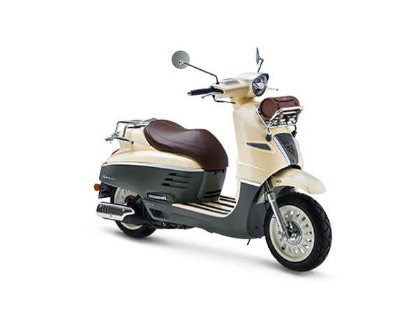
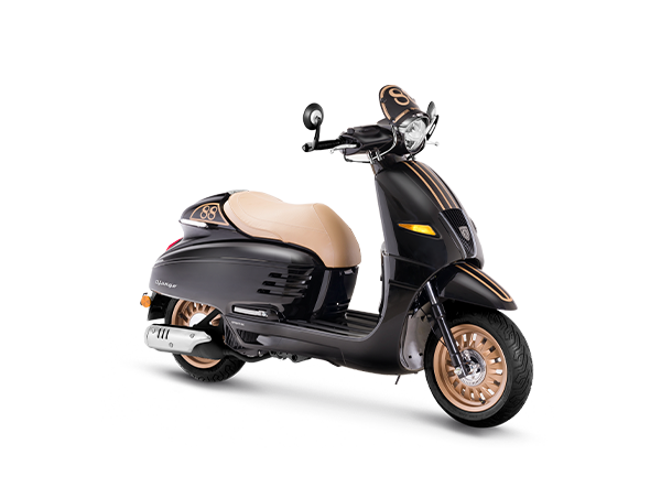
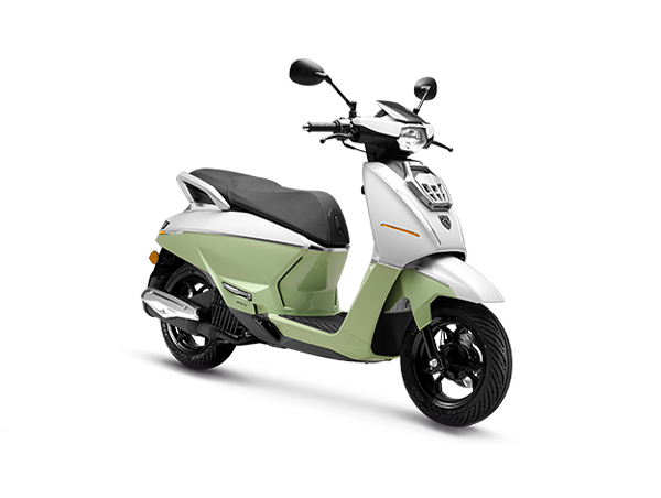
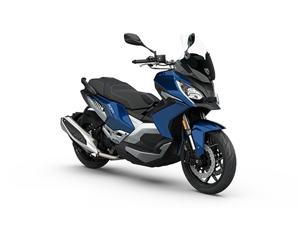
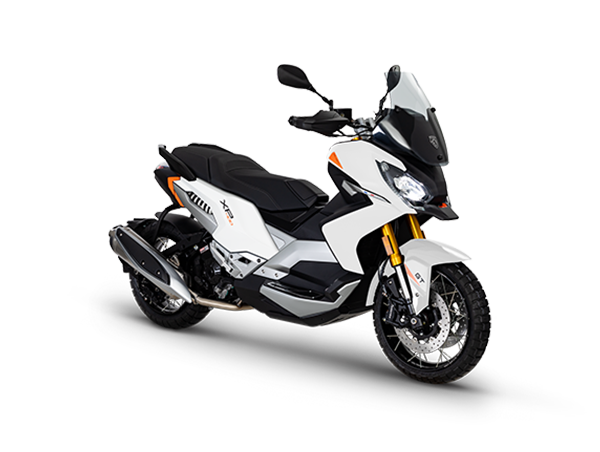
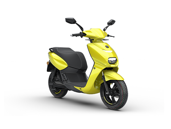
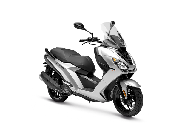
Logo3 WheelersScooterHistory
Logo
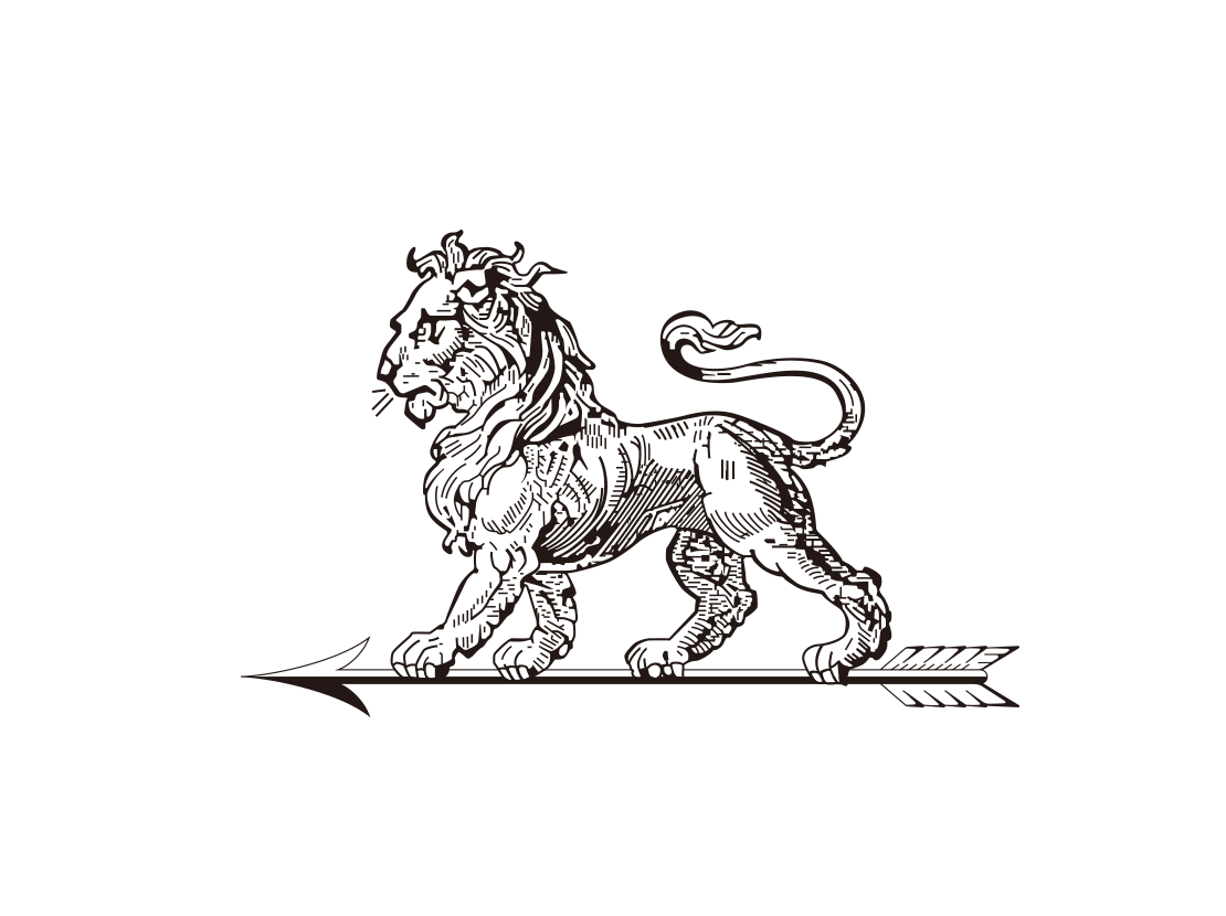
1850
The first logo adopted by the Peugeot Company features a lion walking on an arrow, symbolizing strength, elegance and durability of its products. The Peugeot Brothers began to mark saw blades with such lion logos, and they registered this lion trademark in 1858.
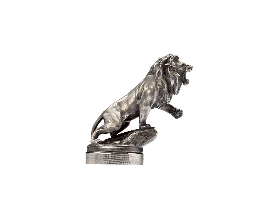
1925
It highlights an individual lion with a stronger three-dimensional sense, showing the moment of lion roaring.
1936
In 1936, the logo design embraced the original heritage of the company. It features a lion standing on an arrow, placed on a yellow shield and depicted in blue, which highlights the brand's prestige and heritage.
1955
At this time, the lion has become a standing lion, and the times has given the golden lion more wildness.
1960
In the 1960s, the company changed the image of the lion to no more than a lion head with thick flowing mane. Its shape is still similar with the classic coat of arms.
1965
Peugeot began to try out with the famous lion outline logo drawn up in thicker lines with a geometric style.It is flatter and simpler.
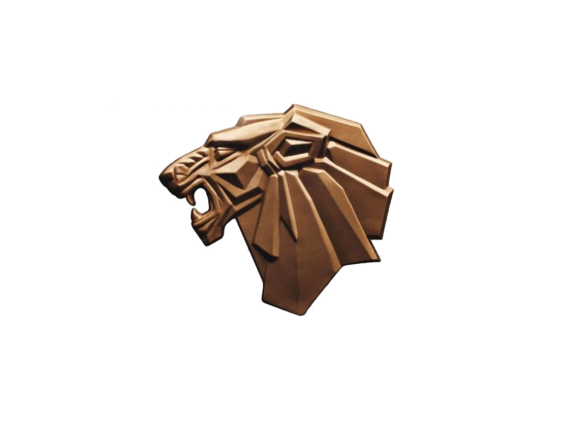
1980
The lion is even more simplified. A legend of times can be shaped with agreesive enterprising spirits. The heraldic Peugeot lion is not only angular, but also hollow in the center. It is known as the "O utline Lion Logo".

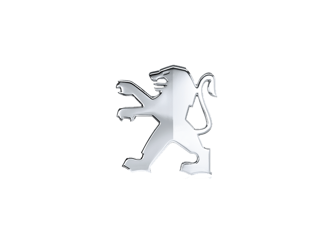
1998
This lion looks fierce, exquisite, handsome and eyecatching. With up-to-date chrome plating process, the new Peugeot lion logo appears to be more three-dimensional and more mordernized.
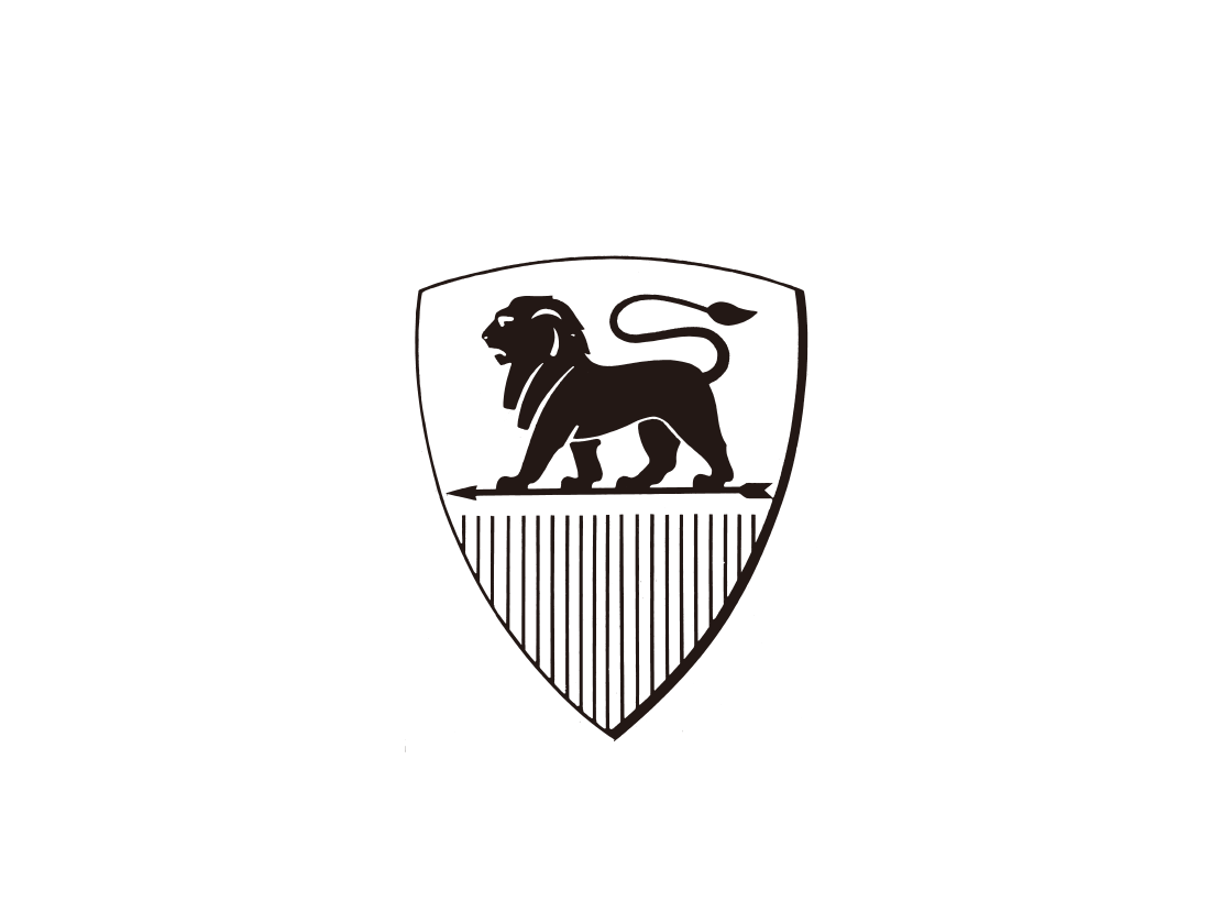
2010
In 2010, the standing lion remians as the major image of the Peugeot brand, which is more dynamic. It has generated a bimetallic effect with the contrasting treatment of matte and gloss.
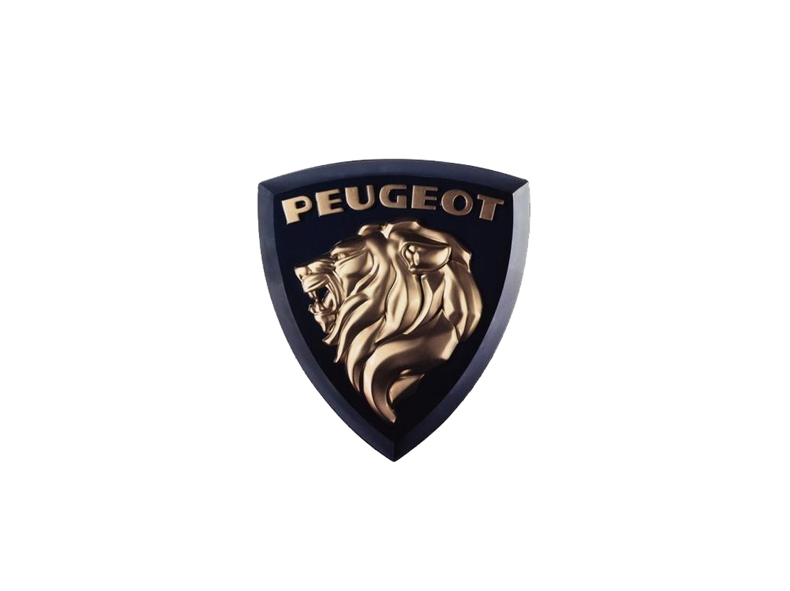
2021
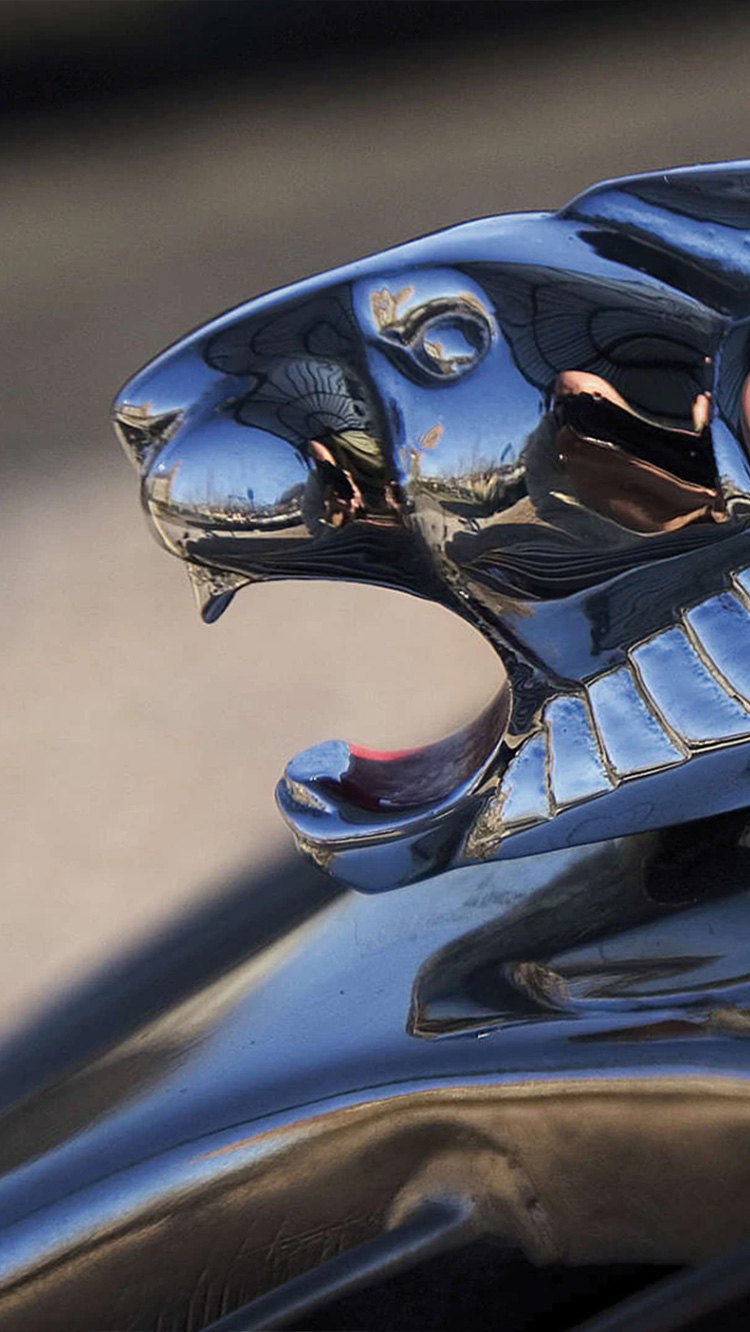
On February 26, 2021, Peugeot unveiled a brand new brand identity, which is a redesigned shield with the image of the Head of the Lion. This new logo delivers a concept that "We are lions, and time is the land we roam."

Copyright Registration Number
Copyright Registration Number: 鲁 ICP 11000908-3 鲁公网安备37010102007167号
鲁公网安备37010102007167号